
The blog of Ohio artist, Nora Sallows, a compulsive oil painter!
Monday, February 27, 2012
Snowy Plein Air
I like the way the ground looks when the snow is half melted. The contrast between the cool white of the snow and the earthy warm ground is a delight to view. I am kind of wimpy about painting outside when it's cold so I painted this little 6" x 6" painting of the view from my living room. I posted a photo with it so those of you who are not familiar with "plein air" can see the difference between what a camera sees and what the human eye sees. I am not saying I captured the scene exactly as it was. Of course I delete things I don't consider necessary and perhaps I embellish colors just a tiny bit. That's my prerogative, as an artist I mean. :) But I firmly believe the brush beats the camera lens if you're looking for a realistic view of the scene.

Friday, February 24, 2012
More Quickies
I woke up early this morning, showered quickly and had an hour to spare before I needed to leave for work. I felt like doing another one hour painting. I bought zuchinni and peppers yesterday for tonight's stir fry so they were an obvious choice. What did I previously say about one hour paintings? Use familiar objects, right? Well rules are made to be broken. I have never painted zuchinni OR yellow peppers before. I decided to add a piece of vintage Frankoma pottery to the set up. I love the earthy tones of the pitcher but they are actually very close to the color of the background so that's another challenge for a one hour painting.
I set the timer and the hour went by unbelievable fast. But it always does when I'm painting.
I set the timer and the hour went by unbelievably fast. But it always does when I'm painting.


I set the timer and the hour went by unbelievable fast. But it always does when I'm painting.
I set the timer and the hour went by unbelievably fast. But it always does when I'm painting.
ZUCHINNI WITH PEPPER
8"X10"

DETAIL--had to pull out the palette knife!

Wednesday, February 22, 2012
Profiles
I don't do a lot of portraits using a profile view. I'm not sure why because they're just as intriguing, in my opinion. This one is a bit larger than life size and I painted it at the request of a client who owns another one of my American Indian paintings. That one is a Nez Perce warrior and the male is facing left. So I painted this one as a mate to that painting, using the same background and solemn side view, but facing to the right.
She is based loosely on another Edward Curtis black and white photograph, circa 1900.

She is based loosely on another Edward Curtis black and white photograph, circa 1900.
12" x 16" oil on canvas
Nez Perce Maiden

Friday, February 17, 2012
Use Quality Materials But Don't Be Afraid to Experiment!
Last night brought another opportunity to admire the work of Edward Curtis, the premier Western photographer, who traveled so extensively among the North American Indian tribes. I adapted this painting from a black and white photograph and added a background from a picture I took in Sedona, AZ last year. I decided to experiment with grounds and I used a support I made myself: a sanded and gessoed 1/2" thick piece of birch. I like this surface for plein air painting because it's so absorbent and it hastens the speed of the drying. The uneven texture of the gesso offers a bit of variety to the paint application too. If you're an artist, you know we're always looking for new ways to explore a subject and sometimes a change as simple as what you paint on can make a huge difference.
Let's talk about materials for a minute. I have watched so many students struggle with cheaply made canvas and student grade paints that I think it's important to begin painting with artist quality materials immediately! How can a beginner judge whether they will like painting if the results they get are dictated by their materials? The answer is that they can't. Low quality paint will almost always result in chalky mixtures and dull color because the fillers in the paint will overpower the pigments.
What you paint on is just as important as the paint you use to paint it with. Quality materials save time and insure your painting will stand the test of time. I once went out plein air painting with some fellow artists and one of the gals showed up with mat board to paint on. I have used acrylics on gessoed mat board but oil paints should never be used on paper supports because they're not compatible. We were painting in a public place and my artist friend actually found a buyer for her painting and sold it immediately. Great for the artist- but not so good for the buyer when he finds out his painting will begin to seriously deteriorate in a few years.
If you're going to invest the time and effort in painting make sure you do a little research and purchase the best materials you can afford. Don't be afraid to experiment but don't compromise the quality of your work if you intend to sell it by using substandard grounds.
CHIEF BEAR CLAW
11" x 14"
oil on gessoed wooden panel

DETAIL
showing the gessoed support
and how it differs from a canvas texture

Wednesday, February 15, 2012
Building Speed Can Help You Become a Better Artist
As artists, we are used to working alone in the studio for much of the time, or outside in the field (alone). Being an artist is a solitary existence. I am blessed that I have a part time job in addition to painting, that forces me to leave the house in the morning and interact with others. If I didn't have that second job, I might not even change out of my pajamas, as the call of the studio would be too great. For me, the routine of a regular job where I meet new people and learn new things every day, adds to my depth as an artist.
My time in the studio is never taken for granted. I have to squeeze in the hours before I leave for work or after I've come home and made dinner (or ordered takeout). Time is valuable and the multi-tasking I do at work and at home has forced me to become more organized. Taxes are easier when expenses and mileage are tracked weekly. Spreadsheets are great for this task. I have a spreadsheet for everything now. It allows me to track where my paintings are hanging, how many I have sold and for how much, what kind of frames, and what sizes I have in stock etc. Organization can save you a lot of time, and you can use those extra minutes and hours to paint! I used to search through boxes looking for a frame that I vaguely remembered purchasing six months earlier. Now I check my spreadsheets and the location is marked clearly because I made time to MOVE the frame into inventory when it arrived at my studio.
Managing time has helped me to paint faster too. When you know you have a finite number of minutes or days to complete a project you tend to focus on getting done.
This brings me to last night's experiment: What can be painted in an hour? You would be surprised! Here are a few pointers.
1) Keep it small
2) Rough the value masses in early
3) Choose an obvious color scheme
4) Paint something you have painted before-- I definitely know pears as I have painted a LOT of them.
5) Watch the clock-- yes-- WATCH it. When you are down to the last ten minutes assess the painting and work hard to achieve some cohesion.
I painted this hand thrown pot and single pear with a spoon in an hour's time, and it really isn't a bad painting. It was made easier because I painted the same pears the day before. When you intentionally limit your time the brain zooms in on what is important and you're basically on auto-pilot. That's why it's a good idea to stop and ASSESS when you are almost done. Set a timer for 50 minutes if you don't want to be a clock watcher, and use those last ten minutes to clean up the edges and bring out the highlights.

I like to Photoshop the paintings into a frame to see what they look like too. It really gives you a better feeling for the piece and how it will look on the wall.

Tuesday, February 14, 2012
Purely Pears on Valentine's Day
I think pears are one of the more appealing fruits to use in a still life composition. I enjoy painting them because they are shapely and very individual. Each pear, like a snowflake, is quite different from another. These are Bosc pears, my favorites to eat, because of their crisp, firm texture. They're also one of my favorite varieties to paint because they seem to have a personality. I like to paint them in groups so I can pose them. In honor of Valentine's Day I used a red backdrop!
I'm always trying something different with these little compositions because you never know when you'll stumble upon a nice color combination. So I used a limited palette on this painting and experimented with eliminating blue from my palette.Instead, I substituted ultramarine violet and the result was a nice warm painting with natural color harmony. One pear stands alone in the light, so I call it "The Sentinel".

I'm always trying something different with these little compositions because you never know when you'll stumble upon a nice color combination. So I used a limited palette on this painting and experimented with eliminating blue from my palette.Instead, I substituted ultramarine violet and the result was a nice warm painting with natural color harmony. One pear stands alone in the light, so I call it "The Sentinel".
THE SENTINEL
10" X 8" oil on panel

Sunday, February 12, 2012
Working in a series
When I do a painting that I enjoy, I tend to want to repeat the process. The Indian girl with the desert background was a lot of fun to paint. I enjoy trying to create skin tones from scratch because it really challenges everything you know about painting. Warm light or cool? Reflected light or not? What if the sun is setting? How much effect does the blue of the stratosphere have on the upturned planes of the face? It's like a puzzle, and I love trying to figure all the pieces out. I have to admit it's become a lot easier since I started painting outdoors. Natural light is so much better than artificial, when you're trying to judge hues.
This is a loose painting of a Sioux chief, inspired by another one of the thousands of pictures taken by Edward Curtis. I took 20 years off the man and lightened his expression a bit. The original was so sad, and I didn't want a sad painting. I mean, I still want the viewer to feel some empathy with the chief but I was mostly after a feeling of pride and slight defiance. I left the headdress very loose and impressionistic.

This is a loose painting of a Sioux chief, inspired by another one of the thousands of pictures taken by Edward Curtis. I took 20 years off the man and lightened his expression a bit. The original was so sad, and I didn't want a sad painting. I mean, I still want the viewer to feel some empathy with the chief but I was mostly after a feeling of pride and slight defiance. I left the headdress very loose and impressionistic.
11" x 14" oil on canvas
$400

Thursday, February 09, 2012
Pastels are Great for Quick Portraits
I think pastels are ideal for quick portraits when you have 3 hours or less with the model. This guy posed for two hours at Common Space in Toledo, where I sometimes paint on Saturdays. He was an interesting guy; a little odd, but then aren't we all, when it really comes down to it? Everyone has their own little quirks and mannerisms and some can quietly drive another person crazy -- if we allow it. I tend to overlook a lot when it comes to people. Quirky can be good. It's almost never boring. He seemed to have a gentle soul and he was able to hold the pose very well, so the guy was a great model IMO.
I finished his jacket and the background at home and for some reason I wanted to name the piece Gypsy Joe. Gypsy Joe, in a black beret, waits quietly with his sketchbook.

I finished his jacket and the background at home and for some reason I wanted to name the piece Gypsy Joe. Gypsy Joe, in a black beret, waits quietly with his sketchbook.
19" x 24" pastel on gray Canson paper

Wednesday, February 08, 2012
The Chief's Daughter
I managed to finally finish this piece over the weekend. I am not sure if I have enough detail in the jewelry yet. On one hand I think the jewelry adds a lot to these almost monochromatic paintings that are created from black and white photos and my imagination. On the other hand, the focus should be on the girl's face and the photo is too fuzzy to really make out what is going on with the jewelry. I love Curtis' photography. Somehow he was able to make the lens capture his subject in almost the same way the human eye does. We can only truly focus on one thing at a time, making everything else around that center of vision just a bit out of focus. I tend to paint with this in mind too, so a lot of my paintings are impressionistic around the edges and sharpen into a bit of detail where I want it to.
The background was taken from a photograph I took in the Sonoran Desert in Arizona last year. The pink clouds were amazing and of course that light really helped me make decisions about what color I needed to have mixed with her skin tones.
I like her as she is but I'll hang her in a frame on the wall of my studio and wait awhile to see if anything jumps out at me.

Monday, February 06, 2012
I pulled out some of my American Indian Reference books today because I needed to look up an image for a painting commission. Most of the photographs in these books were taken by Edward S. Curtis, who left a priceless legacy when he traveled all over the West and photographed as many native Americans as he could. These black and white photographs provide a record of what members from each tribe looked like and what they wore. He recorded their names as well as their faces. The images are out of copyright so anyone can use them as references and I decided to paint another series similar to the one I did five years ago.
I intend to use photographs I've taken in the West and Southwest to add more interesting backgrounds and some of these pieces will be a bit larger than the first series, which consisted mostly of 11" x 14" and 12" x 16" canvases. When this series is painted I will reissue the prints for the older series as well. I have experimented with having some of my prints reproduced on metallic paper and the paper really enhances the look of the print, and adds 80-100 years to the life of the print as the process involves printing on metallic coated paper.
This is the initial coat of paint for "Chieftain's Daughter", 12" x 16" oil on linen.

Thursday, February 02, 2012
Value in Painting
I'm going to discuss values in this post. Not the value you get when you purchase or sell a pianting, but the values that need to be present in the painting itself in order for it to read correctly. I've had enough workshop instructors tell me that VALUE is the most important thing in a painting that I believe it. Value is the relative lightness or darkness of a tone. Using lighter values in the background can add depth to a painting, whether it's a landscape or a still life. Just knowing that objects that are farther away will benefit from being painted a shade or two lighter will immediately allow you to improve your paintings if you try it.
Here is a painting I finished earlier in the week. You can see if I desaturate the color and turn it into a black and white image that the areas in the background are much lighter. We know they are distant because we have the impression of atmosphere being present between the girl and the background. This one is a bit exaggerated to make a point but paying close attention to the lightness or darkness of the subjects in your painting can add interest and variety. If everything was painted equally dark in value the painting would have less impact and the viewer might feel compelled to look more deeply into the background. It's a portrait so the focus should be on the person and this is one way to achieve that.

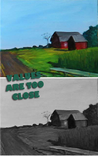
Here is a painting one of my students did a few years ago. There is a big value change between the sky and the objects on the ground but he could have made the trees in the background lighter and he could have used lighter tones on the barn that is further away to add more depth to the painting. I'm not sure what the white thing in front of the weeds is (maybe a guardrail?), but it provides a perfect example of how the VALUE of a subject can really draw the eye. Even when you don't want that to happen. I suggested he change that part but he was kind of a stubborn guy. The nice color scheme in the painting helps to overcome the lack of values, but it could have been even better.

Here's a better view of Shanda, the girl with lovely eyes

Here is a painting I finished earlier in the week. You can see if I desaturate the color and turn it into a black and white image that the areas in the background are much lighter. We know they are distant because we have the impression of atmosphere being present between the girl and the background. This one is a bit exaggerated to make a point but paying close attention to the lightness or darkness of the subjects in your painting can add interest and variety. If everything was painted equally dark in value the painting would have less impact and the viewer might feel compelled to look more deeply into the background. It's a portrait so the focus should be on the person and this is one way to achieve that.

Here is a painting one of my students did a few years ago. There is a big value change between the sky and the objects on the ground but he could have made the trees in the background lighter and he could have used lighter tones on the barn that is further away to add more depth to the painting. I'm not sure what the white thing in front of the weeds is (maybe a guardrail?), but it provides a perfect example of how the VALUE of a subject can really draw the eye. Even when you don't want that to happen. I suggested he change that part but he was kind of a stubborn guy. The nice color scheme in the painting helps to overcome the lack of values, but it could have been even better.
Here's a better view of Shanda, the girl with lovely eyes

Wednesday, February 01, 2012
Leap into Winter
I hear people complain about the short days and long nights of old man winter. I can't really understand it. I relish the opportunity to isolate myself and concentrate on the making of art. February is a slow month for me, both in terms of sales and in terms of getting out of the house. I hate the cold and I don't participate in any winter sports so I tend to go from the house to the car to the store, to work and back to the house without experiencing much activity. In the studio, it's a different story. I have an excuse to spend more time painting and what I like to do in the dark days of winter is paint still life. To me, still life is an unending source of inspiration. I have pots and I have dolls. I have fruit and vegetables. The variety of textures and colors and forms is interesting enough to keep me busy for at least 29 days. It's a leap year this year so we get that extra day, folks!

TOOLS OF THE TRADE 2010
6" X 8" oil on panel $125

Subscribe to:
Comments (Atom)